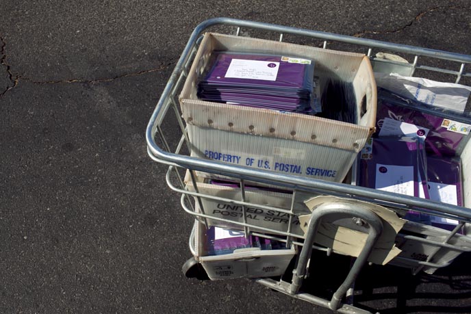
I’ve had a lot of firsts since transitioning to freelance last May. This has been one of the most satisfying to accomplish thus far. My spring print promotion, one of three for 2011.
Last spring, to create a new portfolio better suited to my personal style and the freelance market – after eight years as a newspaper staff photographer, I worked on re-editing through my entire archive of the last decade, looking at literally every image I have shot personally and professionally. After many rounds of edits and developing the concept of pairing my images as diptychs, came the re-brand and new web site creation. I thought all the design and site development would take 6-10 weeks. That was my first lesson that good design and thorough projects always take longer, several times longer, than expected. It took six months, however, the end result created by Greg Lutze of Must Warn Others was 100% what I wanted.
Phase two came last fall, developing a marketing campaign to introduce myself to a wide range of new potential editorial clients, ad agencies and design firms. By referral from a few friends and colleagues, I contacted Jasmine Defoore, a photographer marketing consultant. Jasmine had the background and experience to help advise and collaborate with me on developing a series of self-promos to kick off the next phase of my career as a freelancer. She was a perfect fit and was on-board with my goals, budget and over-all approach to relaunching myself.
Jasmine and I developed ideas for the concept of my self-promo and with a solid project proposal began researching designers and agencies whose work we were each impressed with or curious about. I searched design annuals by PDN and Communication Arts looking for any variety of design that resonated with me and explored links and followed tweet threads from designers I liked, and on and on. We made a list of 24 designers/firms between the two of us and then narrowed that down to seven who we contacted to see if they’d be interested in working with us on the project, and were available. We requested estimates, proposals and timelines.
We had an aggressive timeline we wanted to start by so it was just under three weeks from initial researching to when I contracted with the talented Giorgio Baravalle of de.MO to create this year’s promo magic.
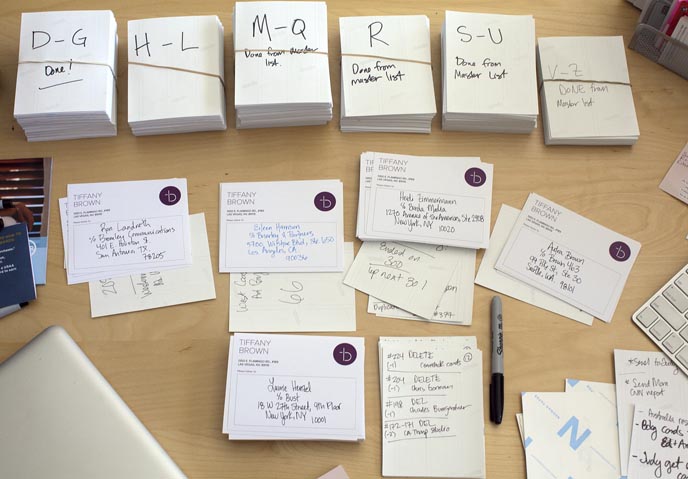
The thing I have learned most is that these things, like the re-brand, always take waaay longer than expected. I decided to hand address all 1400 labels. THAT took way longer than expected too. But alas, this first of three mailers for 2011 is out! I’ll blog more on the creative process behind my re-brand and new site design last year with Greg, as well as the last six months of my work with Giorgio and Jasmine to create this piece. An coordinated e-promo will follow this mailing in a few weeks, and then the schedule of consistent marketing continues from here forward. That’s what all the surveys and experts say, consistent, quality communication is what works. Here’s hoping!
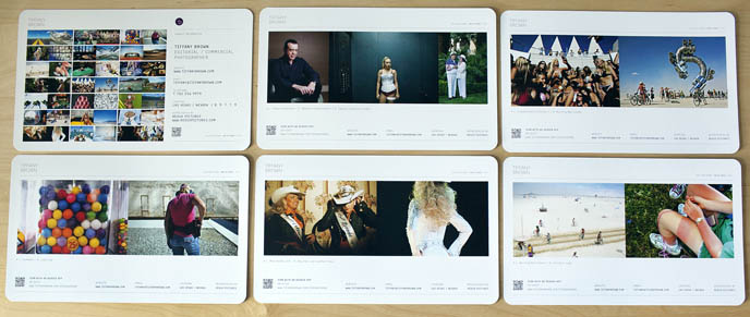
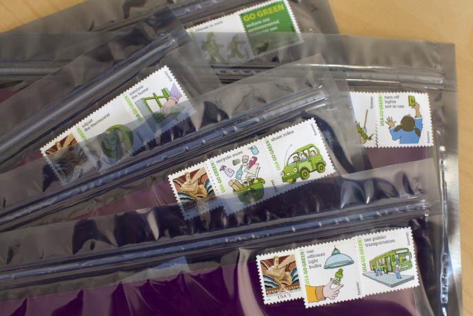
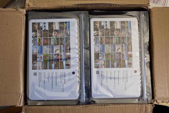
Below are a few glimpses of the finished piece. The promo is a series of six cards printed on 130# Chorus Art Silk Cover, designed around a boarding pass theme, playing off the fact that Vegas is such a travel destination. The cards are packaged in a zip-close silver transparent envelope showing the index card on one side and the opposite side addressed with a branded mailing label and recycle themed stamps.
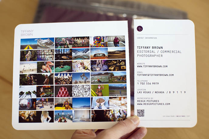
The top index card is perforated so the contact information on the right can be kept, separate from the large card, if desired.
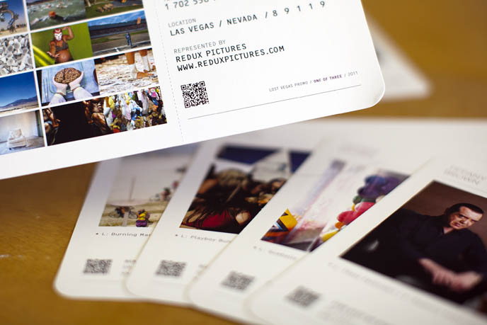
We used a QR code on every card that links to a special spring promo page on my web site for an accompanying print giveaway promotion. Recipients of the print mailer can sign-up to receive a signed, limited-edition print.
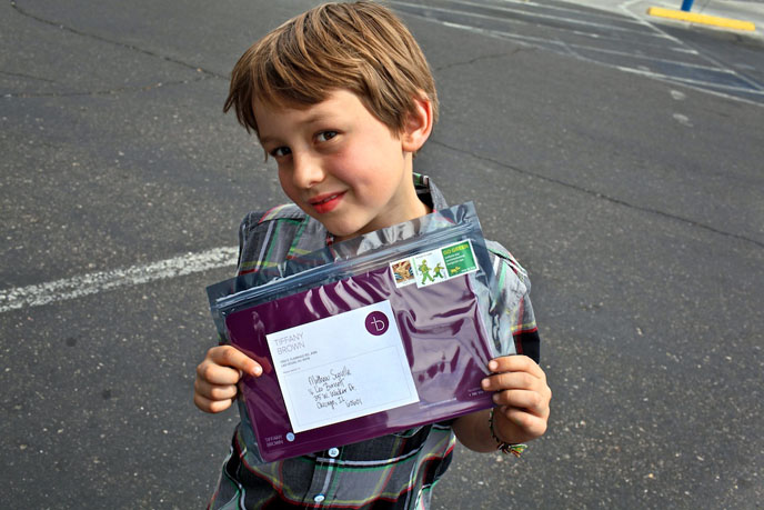
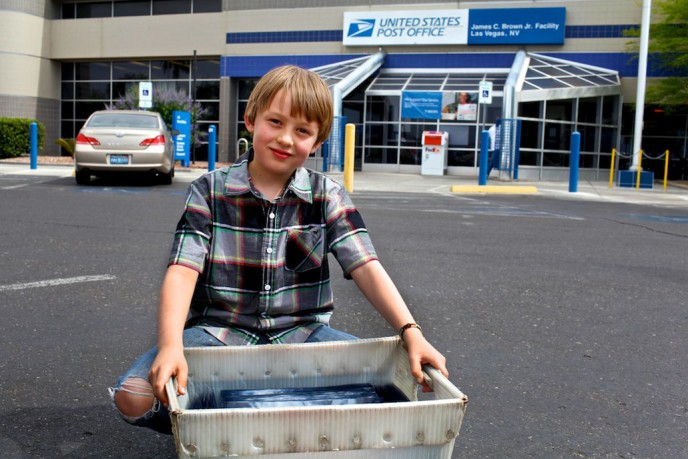
And of course, my best helper, my 8-year-old step son, James.
Leave a Reply
You must be logged in to post a comment.